Page Tooltip: How To Create and Use It
- Soo Reed

- Oct 3, 2022
- 5 min read
A page tooltip has multiple uses. You can use it for drilling through but without changing a page, you can use it for definition of key terms or calculations, or you can use it to show the correct data format when you use switch functions for interactive metric selection. Here is a short video of three ways page tooltip function can be used on your dashboard:
Does any of the usage in the video interest you? If so, let’s start with how to set up a page tooltip and then talk about the three ways of setting this up like in the video in detail.
how to set up a page as a tooltip
To show you a step by step process, I will use the fake experiment dataset you can download here. I will create a simple visualization with a page tooltip of donut chart that looks like this when you hover over the bar chart:

1st step - Have a visualization ready that you want the page tooltip to show up as a tooltip.
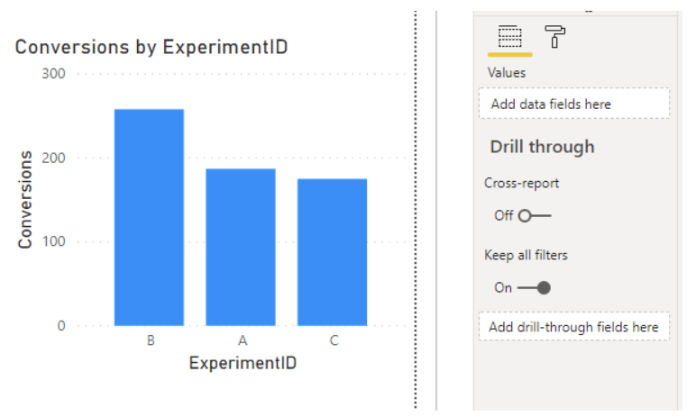
For me, using the experiment dataset, I created a simple bar chart that shows the number of conversions (SUM(Experiments[Conversion]) with Experiment ID as x-axis:
2nd step - On a new page, go to [Format] to change page format
which looks like this:

Go to [Page size] and either choose the preset Tooltip page size or set custom size. This will make the tooltip to show correctly. For this example, I chose Tooltip page size, which is 320 Pixels Width and 240 Pixels Height.
Go to [Page information] and then turn on [Tooltip]. This will turn the page into a tooltip.
 |  |
3rd step - Now on that page, create a table, chart, or anything else you want to display as a tooltip.
For this dataset, I created a new page called “tooltip1” and created a donut chart that shows Conversions by Experiment Variant.

4th and the last step - Set up the page tooltip on the chart you created.
Click the visualization which you want the page tooltip you just created to show up as a tooltip. Then go to the visualization’s [Format] > [Tooltip].
Turn on [Tooltip]
Change the settings:
[Type] should be: [Report page]
[Page] should be: the page tooltip name you created

Now you finished setting up a page tooltip! To test, hover over the visualization to see the donut chart. The donut chart values should change based on experiment ID:
Example - when you hover over Experiment ID B: | Example - when you hover over ExperimentID A: |
 |  |
Now the only thing left to do is to hide the tooltip pages so the users do not just stumble on these tooltip pages. To do so, right click the page, and click “Hide Page”. You will see the eye crossed icon on that page after:
 |  |
three ways of using a page as a tooltip
Now that you have mastered how to set up a page tooltip, let’s talk about three ways of using this tool to make your dashboards stand out! They are:
Drilling through within the same page without drill through function
Showing definitions or explanations without using text box
Showing the correct data format when using an interactive metric selection (SWITCH)
We will talk a little more in detail about each of them. But if you don't have time, or want easier way to share, check out this infographic, infographic - 3 ways of using page tooltip.
first usage - drill through without changing a page or using drill through function
Drilling through is a wonderful way of digging deeper with data; but it can be painful because sometimes users just want a quick glance of distribution instead of changing the page. Page tooltip is created for that! If you followed the steps above on how to, you learned how to create a visualization of drilled through without changing a page.
second usage - use for definitions and explanations
As analysts, you will get questions on definitions or how certain calculations are created. You could write it out as a text, but that could make the dashboard look cluttered. So why not use a page tooltip so the definitions or helpful guide only show up when you hover on a certain button? Here’s a brief how-to guide with an example:
First, I am creating a question measure that is empty. I literally wrote: ? = “?”

Second, either import an excel sheet with words and definitions or create a table by using [Enter data]. I am using [Enter data] to show how growth rate is calculated in this report. This is what I wrote:

Third, create a page tooltip with the table you created. If you are not sure how, go back to how-to set up a page tooltip. Mine looks like this:

Lastly, use a “card” visualization to put the measure ? and then put the page tooltip as a tooltip. This is the end result of using a page tooltip as a definition or helpful explanation:

third usage - data format when using switch functions for interactive metric selection
If you created an interactive metric selection before, then you know the data format frustration it can bring (if you don’t know what an interactive metric selection is or how to create one, check out [How to create an interactive metric selection for one visualization]; this is an awesome way to level up your dashboard!). When the different metrics involve different data formats, such as currency, percentage, whole numbers, decimal, the SWITCH functions cannot display them correctly. Out of frustration, if you tried to format the data within the measure using FORMAT() function, you probably were as dejected as I was when a chart would refuse to show any value as you changed them as text from number. So you get stuck with conversion rate looking like this in the tooltip instead of proper % and enough digit:

Now you do not have to settle for this because of page tooltips! By using a page tooltip, you can make sure the tooltip for the chart will change its data format according to the metric selection. Here’s a brief step-by-step how to guide:
First, write another interactive metric selection measure but this time with FORMAT() function and defining data format for each metric.
For my experiment fake dataset, I wrote the following:
Metric w/ dataformat = SWITCH(VALUES(‘Metric Select’[Metrics]), “Sessions”, FORMAT(SUM(Experiments[Session]), ”#,##0”), “Pageviews Per session”, FORMAT([Pageviews per Session] ”#.#0”), “Conversions”, FORMAT(SUM(Experiments[Conversion]), ”#,##0”), “Conversion Rate”, FORMAT([Conversion rate], ”#.#0%”), “Revenue”, FORMAT(SUM(Experiments[revenue]), ”$#,##0”), “RPC”, FORMAT(RPC], ”$#,##0”) )
***To learn more about FORMAT() and the data formatting in dax, visit Microsoft Document on: Pre-Defined Numeric Formats for the FORMAT function and Custom numeric formats for the FORMAT function.
Second, create a page tooltip using this metric.
For me, I created a matrix with ExperimentVariant as rows, Metrics (the column) as columns, and Metric w/ dataformat as the value:

Lastly, use this page tooltip as the tooltip for your actual visualization with the incorrect data format.
Since on this page, you do have a slicer with a metric selection, the tooltip will show only selected metric:

You can use a card or other visualization you want to make this happen. Whatever you use, now you have a correct data format showing up for each metric!
conclusion
Setting up a page tooltip is simple while it enhances users’ dashboard experiences immensely. Simple gestures from a dashboard creator like providing a correct data format, giving an explanation or definition when needed, and making a hover over drill through visualization can help users navigate through the data without asking the creator every single step. It is intuitive and interactive while keeping the number of pages low for the dashboard (which helps the users, again!). Seeing this, how do you want to use a page tooltip? Which one has been the most helpful for you? Also, can you think of another way of using a page tooltip?
Lastly, don't forget to check out this infographic for "3 ways of using Power BI Page tooltip".


Comments