Supervised Machine Learning with Python for Beginner
- Soo Reed

- Mar 10, 2022
- 7 min read
Updated: Oct 3, 2022
Machine Learning Demo with Python for beginner
From CodeCademy, I got this file to practice machine learning in python. All I know of the data is that it has to do with an online dating site, so let’s dive in together to demonstrate Supervised Machine Learning and Exploratory Data Analysis using python. This is a demo for beginners to show which steps to take and how to implement certain codes. You can just read through this but I highly recommend copying the jupyter notebook file here and read the actual code I wrote and play with the data and the parameters. Let’s dive in!
Import libraries and data
First, I am going to import a few libraries that I often use along with the data using pd.read_csv(). I am adding header = 0 to indicate that the csv file has a header on it that I want to preserve. And I am checking the data to make sure it looks good.

Inspecting and Cleaning the data
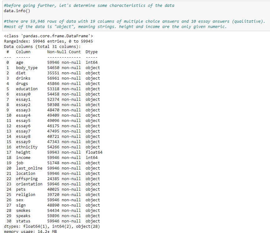
Since I am not familiar with the dataset, I want to inspect it using df.info(). We can see that there are 59,946 rows of data with 19 columns of multiple choice answers and 10 essay answers (qualitative). Most of the data is “object”, meaning strings. height and income are the only given numeric.
Unless you are working on text analysis, essay questions and answers will be difficult to use. So let’s reduce the number of columns we are examining by excluding 10 essay columns.

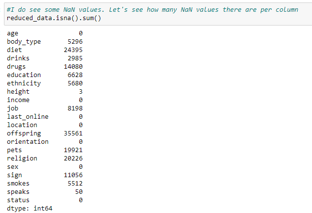
Looking at the reduced data, most of them seem to be usable. But I am also seeing quite a few NaN values in many of the columns. Before we go further, I want to see how prevalent NaN value is in each column.
Exploring the data using visualizations
Now that we are more familiar with the dataset, let’s visualize this data to see what may interest us to dig further. Since every row of the dataset is a profile, I want to create a bar chart by counting profiles per category in a given column. Since we are dealing with many columns, I will use for loop to plot countplots for all of them. Doing so is convenient but it may take too long as you can imagine. To not have that issue, I am not including certain columns that have too many categories and therefore will not be useful as a countplot such as last_online, speaks, ethnicity, location, and education.
***to see all the visualizations, download the profile.csv and get my code from github and run the code.
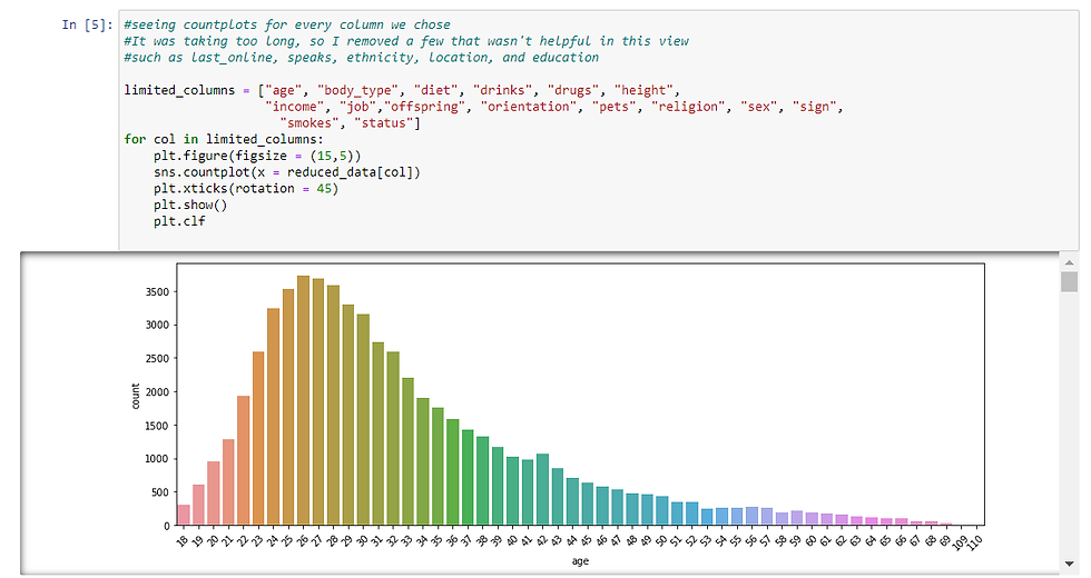
As you can see, jupyter notebook creates a scroll on the right so I can scroll to see all the charts created. Use the jupyter notebook and scroll down. I am noting a few observations down here:
age is right skewed with the mode being 26. Also there is a point for 109 and 110. I wonder if they are legitimate.
there is a “used up” body type. What is that? we may need to clarify what that means.
drink is overwhelmingly done socially.
drug usage is also overwhelmingly never.
education, ethnicity, location, religion, and speaks are not clearn using the chart due to the text lengths. We will have to examine them separately.
heights seem to be close to normal distribution. I wonder if it would be more insightful with other categories, like sex. Also there seems to be a couple of outliers like 95 and 36. I wonder if they are legitimate
although income showed 0 NaN, according to the chart, most people did not answer the question and the NaN in this case is -1.
last_online and signs should be cleaned and grouped before exploration.
orientation is mostly straight.
there are more males than females.
smokes is overwhelmingly no.
status is overwhelmingly single.
Countplot with Category on y-axis
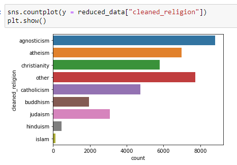
As mentioned earlier, I excluded some columns because they had too many categories. But for some of them, plotting the countplot horizontally may help. If you are dealing with too many categories to plot in x-axis but they could be neatly plotted in y-axis, you can do so by specifying the y in countplot to be categories. I am doing so here for education, religion, and sign.
***to see all the visualizations, download the profile.csv and get my code from github and run the code.
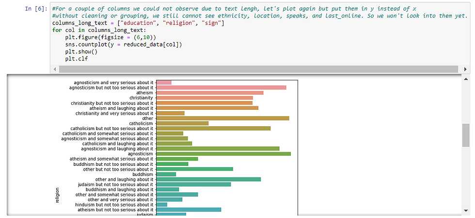
It is a lot easier to read them and digest them when they are plotted horizontally. And now that I can see the countplot, let’s make some observations:
For education, graduated from college/university is the majority.
For religion and sign, there seems to be a few religions & sign to distinguish (ex. for religion: agnosticism, christiantiy, atheism, catholicism, buddhism, judaism, islam, hinduism, and others) and also the degree of “seriousness” (lauhing about it > not too serious about it> somewhat serious about it > vrey serious about it). So if religion or sign is something you want to explore, then it can be thought of in two ways ; by type and also by degree.
Aggregated look of religion and signs
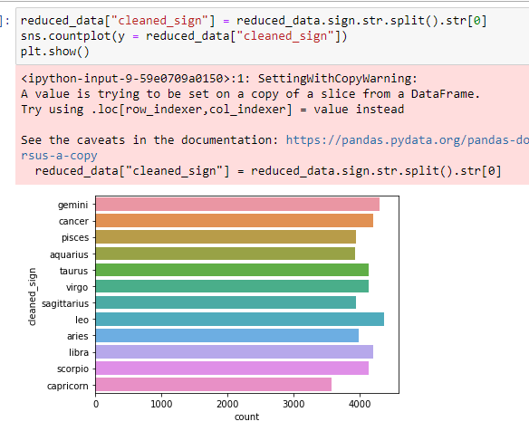
I am curious about the proportion of each religion. Let’s clean it up and see the countplot again. Since the name of the religion is the first word of each choice, we will take the first word from the answers. We can do so by using .str.split().str[0]

Now that we have a new column, let’s use it to visualize the amount of profiles for each religion:
And similarly, we can see the countplot for each sign:
**Here you do not need to worry about the warning note at this point. It still gives you the correct output you want.
By Gender
Looking at all these countplots, I am curious if there is a trend for each gender. Let’s pick a few columns to see if we can spot a trend: age, body_type, height, cleaned_religion, job. For these columns, I will re-plot the countplots but with sex as hue.
***to see all the visualizations, download the profile.csv and get my code from github and run the code.
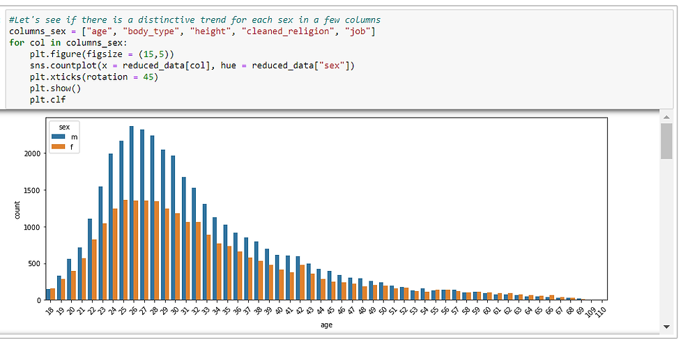
There definitely seem to be trends for each column per gender, but since we had more males than females according to an earlier countplot by sex, I want to see this same chart but in %.
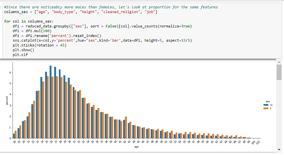
Sex definitely seems to hav effect on age, body_type, height, religion, and job. Now, will we be able to predict one’s sex based on these features?
Since sex is categorical variable and we are practicing supervised Machine learning, we have a few choices:
logistic regression K-NearestNeighbors Classifier Multinomial Naive Bayes Support Vector Machine Decision Tree & Random Forest
Before we predict sex based on the available columns using any of these algorithms though, we need to preprocess the data.
Preprocessing
Dealing with Nan value
First, let’s create a dataframe with only the columns we are interested in, and then drop NaN value. Since column_sex set earlier has all the features I am interested in except for sex itself, I will add sex column to it to use it. Then I will use .dropna().

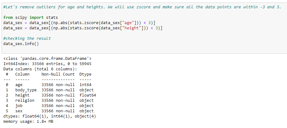
Removing outliers
Looking at the countplots from earlier, there were age and height data that seemed incorrect such as age 109 but in graduate school and height 1 inch. I want to get rid of outliers for better model output. To do this, I am removing the data points with z score that is 3 or higher.
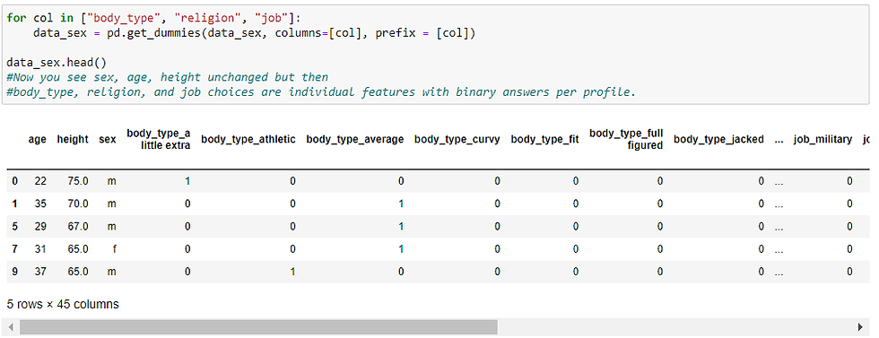
Categorical variables into dummy variables
To input data into ML models, we need to make sure the input data are numeric. There are a couple of options:
For binary or ordinal categories, we can map the data.
For other categorical values with no particular order and different degrees between values, we can create dummy variables, making each categorical value as a column and give a binary value.
Since age and height are already numeric, we do not need to worry about them. But we do need to convert body type, religion, and job. These categories do not have any particular order, so we will want to use the dummy variable method. Sex does not need to be converted because that is the label, not input data.
Imbalance Classification Problem
As we saw before, there were noticeably more males than females in this dataset. This can cause an imbalance classification problem which indicates biased or skewed data. So let’s see the cleaned data and see if the imbalance in the prediction label is enough to cause a concern.
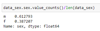
Out of 33,566 profiles, 61% is male and 39% is female, rendering 6:4 ratio. That is a slight imbalance and it is not as concerning. So we will proceed in this analysis.
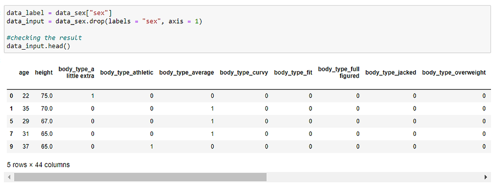
Column Split between input data and label
To feed the data into machine learning models, we are separating here input vs. label (outcome).
Train Test Split
We will want to test out the model with test data, so I am splitting the current data so we can use 80% of it to train the model and 20% to test out the model.

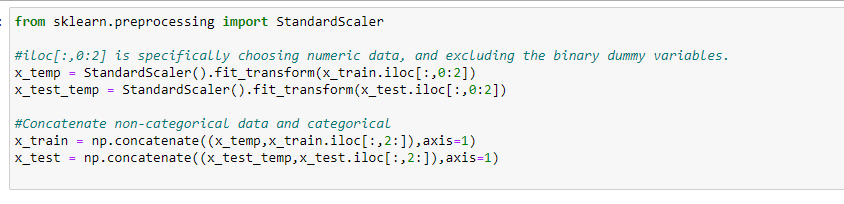
Scaling: Normalizing the numeric data
Lastly, we need to normalize the data so that the scale is the same. Without this step, your model may put heavier importance on a variable due to a different scale. I am going to use StandardScaler() to do this.
Prediction
I am going to use logistic regression, KNN Classifier, and Random Forest and see which one has the best result. So let’s create a model, fit the training data, and see the score for test data for each of them.
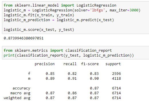
Logistic Regression
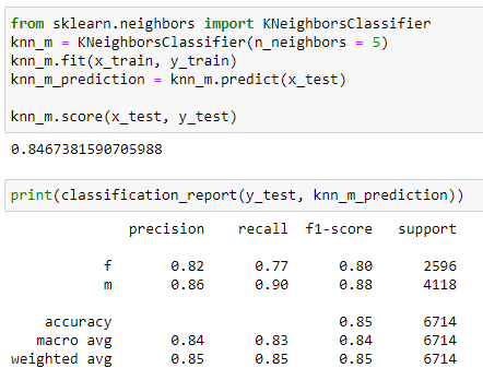
K Nearest Neighbors Classifier
Random Forest
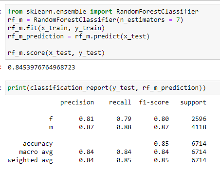
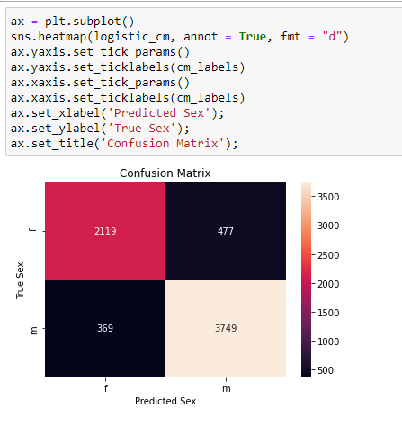
All the models seem to be doing a pretty good job with similar score at predicting the gender based on age, height, body type, religion, and job: 84~87%. Since logistic regression did slightly better on the test data, let’s see its confusion matrix before we finish.
Confusion Matrix

Since the confusion matrix is hard to read without label, let’s use a heatmap for quick interpretation.
Conclusion
While exploring the data at hand, we saw different trends for age, height, body type, job, and religion for each sex. So we used machine learning algorithms to predict the sex of OkCupid user based on those features and see how accurate the models were. Currently we have the highest 87% score, which is definitely better than a random guess (50%). Based on the data exploration step, what other features do you think could be used to bring up the score even higher?
It is also important to think about the business use cases. The sex prediction was a relatively clean practice of machine learning, but it does not help OkCupid business since it is unlikely for people to not add sex, but then add all the other features in the dating profile. Thinking of that, what other category do you think OkCupid will benefit by predicting? And once you decide which category, can you think of the list of features you want to input to create models?


Comments