4 steps to create one chart with multiple metric choices
- Soo Reed

- Dec 30, 2020
- 5 min read
Updated: Oct 3, 2022
How to create an interactive metric selection for one visualization
Problem
A stakeholder has multiple metrics they want to look at in charts that are formatted in the same way. I could create five different visualizations in one report page or across several pages. But it is clunky and seems unnecessary for the purpose of the dashboard. Putting all the visualizations in one page makes each visualization too small, while I don’t want to create multiple pages just for the same kind of visualization. Is there a way I can use one chart with multiple metrics to select from?
The answer is Yes! You can follow these 4 simple steps to create a chart that will show different values based on the metric you select using a slicer. This will be interactive, engaging, and also intuitive with a slicer for users. Let’s get into it!
***two things to note:
there will be times you will want to create multiple charts with the same format within a page for easier comparison; we will talk about it another time. For now, let’s focus on how we can make this dynamic chart and slicer for a more engaging and simpler dashboard.
Unfortunately with this method, you cannot set each metrics’ data format; you can only set it on the chart for all the metrics. Unless all the metrics you put are for the same data format ($, %, 0.00, etc. ), you will want to keep the data format as “Auto”. But fear not! There is a way to have the tooltip show the correct data format for each metric with a few extra steps. To learn how to, go to this blog [Page tooltip].
Solution
So let’s create the functionality for users to choose a metric and then make a single visualization that will show the chosen metric.
TLDR
Create a table with all the names of the metrics you want to display in a single chart
Create a dynamic measure that using SWITCH and VALUE functions
Step by Step Guide with fake dataset
Here’s a fake dataset of experiments data we will use:
Screenshot showing only a part of the dataset:

Now, what I want to do is to create a visualization of session, conversion, revenue, conversion rate, and pageview per session metrics with date as x-axis and experiment variant as legend. The chosen metric will be y-axis.
1st step - create any basic calculated metrics that are needed
For this dataset, I will need pageviews per session, conversion rate, and RPC (revenue per conversion). So I will create following measures:
Pageviews per session = SUM(Experiments[Pageviews])/SUM(Experiments[Sessions])
Conversions rate = SUM(Experiments[Conversion])/SUM(Experiments[Sessions]) RPC = SUM(Experiments[revenue])/SUM(Experiments[conversion])
For my own sanity, I love creating a key measure table to keep all the measures in one place. If you don’t know about key measure tables, go here to learn what it is and how to set it up!
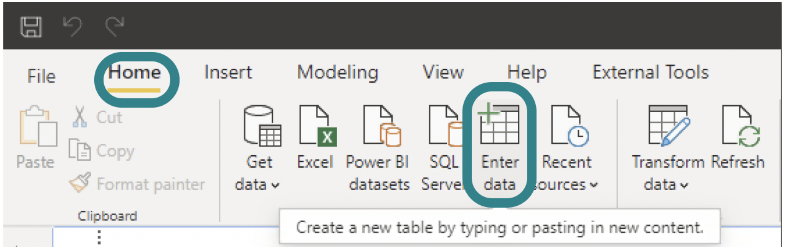
2nd step - create a table with all the metrics you want to display in a single visualization
In power bi, click [Home] tab > [Enter data] and create a list of possible control variants.
Then you will see a prompt where you can write table name, column name, and insert values. For my dataset, I created: Sessions, Pageviews per session, Conversions, Conversion Rate, Revenue, and RPC (Revenue per Click).

3rd step - create a metric selection measure using SWITCH and VALUES functions
Here’s the DAX code template you can use:
Measure Name = SWITCH(VALUES(‘Table Name'[Column Name]), “Metric Name 1“, Measure for Metric Name 1, “Metric Name 2“, Measure for Metric Name 2, “Metric Name 3“, Measure for Metric Name 3, … )
You can edit all the highlighted parts to match your table and metric information. Make sure your Metric Name matches your value in the table; it is case sensitive and they have to be an exact match for this measure to work properly. For my example, I wrote the following:
Metric Selection = SWITCH(VALUES(‘Metric Select'[Metrics]) , “Sessions”, SUM(Experiments[Session]) , “Pageviews Per session”, [Pageviews per Session] , “Conversions”, SUM(Experiments[conversion]) , “Conversion Rate”, [Conversion rate] , “Revenue”, SUM(Experiments[revenue]) , “RPC”, [RPC])
This code is pretty straightforward. It means, based on the value of ‘Metric Select'[Metrics], the returning value will switch accordingly. For instance, if the metric value is “Sessions” then it will return SUM(Experiments[Session]).
As you can see, I used both existing measure names such as [RPC] and DAX such as SUM(Experiments[Session]) as the corresponding and responding values to be called depending on ‘Metric Select’[Metric] value. You can choose whichever you prefer here although for the sake of consistency and organization, I would recommend creating these measures and calling the measures here instead of writing dax right on the spot.
4th (and the last) step - create a metric selection slicer and make a visualization

Now all the heavy lifting is done. Now let’s create a slicer with ‘Metric Select'[Metrics] as the field.

For the slicer, go to [Format] > [Selection controls] and make sure its setting is on “single select” for the SWITCH function to work properly.

Then you will see your slicer like this with a round button which shows users that the slicer takes only a single selection.
Now, create a chart you want – it can be a line chart, bar chart, or even a scatter chart. Whichever chart you create, put the measure you created in Step 3 as the values.

For me, I am creating a line chart with:
X-axis = date Legend = Experiment Variant Value = Metric Selection (the measure you created in the last step)
This is it! Try toggle between different metrics using the slicer you created and test your measure. Now you have a visualization that changes dynamically based on the metric you choose.
Example screenshots for my line chart:
Conversion Rate selection:

Sessions Selection:

This is pretty awesome but one thing that bothers me is that I cannot set different data formats for each metric. For instance, sessions should be whole numbers, while conversion rate should be %. Right now if you hover over a chart when conversion rate metric is selected, it looks like this:

Changing the chart’s data format would not work since each metric has different data formats. If you just add FORMAT() function to Metric Selection measure, it will just not show value on chart because FORMAT() turns everything into “text” and therefore no chart. So the only way to show the correct data format depending on the metric choice is to use a page tooltip. Learn how to do this at Page Tooltip blog. Then you will be able to show this instead for conversion rate:

Conclusion
There will be times it does not make sense to create multiple charts of the same format (same x-axis, and same legend) for different metrics. When that happens, now you have an option to create a single visualization and to provide users an option to choose metrics. Instead of cramming six visualizations in a tab, having this one single visualization will not only draw everyone’s attention, engage them with the dynamic interaction, but also allow the users to see the chart in detail with its appropriate size.
I use this method almost every time I create a dashboard; this is a great way to satisfy the customers who seem to want charts for every possible metric. Have you tried this method? If so, how do you like it? Comment below and let me know your experience.
Before you leave, again, make sure to check out this blog on page tooltips so the interactive chart will show the correct data format on its tooltip!


Comments