comparing values of multiple date ranges
- Soo Reed

- Feb 8, 2021
- 6 min read
Updated: Oct 3, 2022
Comparing aggregated values of multiple date ranges
What if you want to compare a metric between two or more different date ranges? Was revenue from the first week of March higher than the last week of May? How can we make the comparison between the aggregated metric of two different date ranges easy and intuitive? Can we give end users the flexibility to choose date ranges? Can we do this without making the data model complex? The answer is a resounding yes. In this blog, we will explore a flexible and simple way to compare values between two chosen date ranges. The blog will specifically guide you through two date ranges, but you can use the same methods to create more date ranges to compare.
Solution
Let’s create a functionality where users can choose two different date ranges and the program will spit out whatever metrics they want to see in those two different date ranges. The end result can look like this (in this example, we are comparing RPC in two different date ranges):

TLDR
Create two calendar tables
Make one calendar “master calendar”, connected to fact tables with active relationship
Make the other calendar connected to the master calendar with inactive relationship
Create distinct measures based on each calendar for each metric you want to compare using “USERELATIONSHIP” function
Make appropriate slicers and visuals to use these measures and see the result
Step by Step Guide with fake dataset
Here’s a fake dataset we will use. This dataset includes random revenue and clicks from March 1, 2020 to July 15, 2020.
Screenshot showing only a part of the dataset:

First Step - create two calendars
You can make your calendars complex with many delicate columns but for this particular blog, let’s keep it simple. So I will create two different calendars using CALENDAR formula. I will name one “master calendar” and one as “compare calendar”. To do so, go to “Data” view and click “New Table” under “Table Tools” as shown in the screenshot:

As in the screenshot, you will create two calendar tables using these formulas:
Master Calendar = CALENDAR(DATE(2020,03,01), DATE(2020,07,15)) Compare Calendar = CALENDAR(DATE(2020,03,01), DATE(2020,07,15))
Second Step - connect master calendar to a fact table with active relationship
Make “master calendar” have an active relationship with a fact table (which in this case, the fake dataset) by connecting Calendar’s Date column to Revenue_Clicks’ Date column. It will show a solid line with an arrow and 1, showing an active one to many relationship.

Third Step - connect compare calendar to master calendar with inactive relationship
This step is to make “compare calendar” have an inactive relationship with “master calendar” by connecting both calendars’ date columns. When you connect the two date columns from calendars, it will create an active one to one relationship between the two tables. It is because both calendars have only one unique date (as they should), so connecting the two automatically creates such relationship and shows a solid line with two arrows pointing opposite way, with number one on each side, looking like this:

To make it an inactive relationship, double click the line. Edit relationship window will pop up and you uncheck “Make this relationship active” as shown here:

When you click OK, you will see the solid line became dotted between the two calendar tables:

***Side Note:
This third step may leave you wondering why you would not just connect both calendars directly to the fact table. Because at the end of the day, you have to create measures based on each of the calendars, so what is the benefit of making one calendar “inactive”?
If you are asking this question, first I want to acknowledge your critical thinking and knowledge in Power BI. In fact, you could absolutely connect both calendars directly to the fact table and create measures for exactly the same result for the end users. Doing so will possibly be easier too, if you only have one fact table, since you don’t have to use USERELATIONSHIP Dax function for one of the calendars (if you are not sure, go and read the rest of the steps first). That way, however, will make your data model unnecessarily more complex with two active calendars if you have more than one fact table.
Let’s say you have three fact tables; you will have to connect all those tables to two different calendars. That also means, you have two calendars to keep up with. For instance, if you want to make a date range limitation for the entire dashboard, you will have to make sure both of your calendars are specifically limited. But if you are using this inactive relationship, you only need to keep up with one calendar in general (“master calendar” that is connected directly to the fact table), and your data model will be cleaner as your second calendar is only connected to the master calendar.
This way also allows you to compare more than two date ranges easily; you can have as many calendars as you want connected to this one master calendar, rendering more than 2 date range comparisons without complicating the data model. This is why I recommend using this inactive relationship along with USERELATIONSHIP Dax function rather than to connect the fact table directly.
Fourth Step - Create separate measures that calculate metrics for each calendar
Now you need to create distinct measures that will calculate metrics based on each of the calendars. For instance, let’s say you want to compare RPC (revenue per click) between two date ranges chosen using the separate calendars. Then create two RPC measures: one based on “master calendar” and the other on “compare calendar”. I am going to create these measures under “Key Measure” Table (if you don’t know what key measure table or why you should use it, check out this blog).
RPC = SUM(Revenue_Clicks[Revenue])/SUM(Revenue_Clicks[Clicks]) RPC2 = CALCULATE([RPC], ALL(‘Master Calendar’), USERELATIONSHIP(‘Master Calendar'[Date], ‘Compare Calendar'[Date]))
Here, the first [RPC] is based on Master calendar that is connected to the fact table directly, and [RPC2] is based on compare calendar by using USERELATIONSHIP function. If you want to know more about USERELATIONSHIP, check out the doc from Microsoft here.
Whatever metric you want to compare between two chosen date ranges, use DAX above and change out RPC to the metric you want to see. For instance, if you want to see the SUM(Clicks) between two date ranges, you will do:
Clicks= SUM(Revenue_Clicks[Clicks]) Clicks2 = CALCULATE([Clicks], ALL(‘Master Calendar’), USERELATIONSHIP(‘Master Calendar'[Date], ‘Compare Calendar'[Date]))
Last Step - Make appropriate slicers and visuals to use these measures and see the result
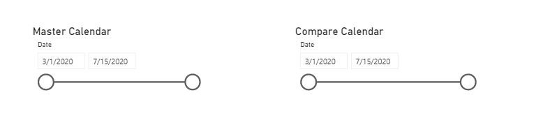
Now you have everything you need to compare the RPC between two date ranges. So all you have to do now is to create slicers and visuals that will showcase your work. First, let’s create two slicers where your users can choose date ranges. Click Slicer and drag Master calendar as shown in the screenshot:

Then to make it less confusing, let’s change the title of the slicer to “Master Calendar”. Go to Format and type the title as shown here:

Now let’s do the same for the Compare calendar. Then you will have two slicers like this:
Next, let’s create a visual that will show RPC based on these two calendars. There are a lot of options to do this, so let’s try a few: 1. Line chart 2. Clustered column chart, 3. Table. I will create these visuals and put [RPC] and [RPC2] as values. See the result below:

A few things to note here:
I added a border and changed the color of each visual’s title so you can easily see the different visuals.
I changed each calendar’s date range so you can see the comparison; without changing it, the visualizations will show the same RPC since they would be selecting the same date range.
I made RPC to have currency format and gave 2 decimal points
The visuals I displayed here are shown in red circles in the screenshot
As you can see, each visual has its own pros and cons. But the important point is that our measure works based on the calendars. You can, of course, change the name of the measures or calendar name to make this more intuitive to end users.
bonus - GROWTH/DECLINE RATE CALCULATION
Additionally, you can use these measures to calculate % growth/decline rate simultaneously. For this RPC comparison, I created a measure using:
RPC growth Rate = ([RPC2]-[RPC])/[RPC]
Now, if you put the result of this into the table, it will show:

And the growth rate will calculate automatically based on the chosen date ranges! The only thing you need to be careful with is the “base” of the growth rate calculation. In the dax above, I am calculating [RPC2]’s growth/rate decline rate compared to [RPC] (therefore, [RPC] is the baseline of the comparison, which means, “Master Calendar” is the baseline date range). As long as you remember that distinction, the % growth rate will help you quickly compare the metrics between the two date ranges.
Conclusions
When you want to compare an aggregated metric in two different date ranges, there are a few options. You could hard code the date ranges within a measure or you could create two calendar tables and then connect both of them to the fact table directly. Hard coding, however, will not give you the flexibility to change the date range easily. And connecting the two calendars directly to fact tables will also reduce flexibility and create confusion; there will be multiple active calendars instead of one, and you will have to make active relationships between the two calendars and each of the fact tables, rendering the data model complex and rigid. It becomes even more cumbersome and complex if you want to compare more than two date ranges; what if you want to compare four or five different date ranges? Using the inactive relationship and USERELATIONSHIP function provides the flexibility that you will need.


Comments