Power BI Line Chart: total line with legend
- Soo Reed

- Sep 9, 2021
- 3 min read
Updated: Oct 3, 2022
Power BI Line Chart: adding a total line when you still want Legend
In one of my Power BI reports, I have a line chart that shows the sales amount divided by product category as legend, with a slicer to choose multiple categories. One day, I was asked to add a “total” amount into the line chart, along with the product category. Oh, and they want the total to reflect the slicer choices; only the categories that are chosen.
Unfortunately, there is no easy way to add a total along with the legend choices in the line chart. But there is one trick. One downside — this requires a measure to be written for each legend item, and it is not suited if your legend is bigger than a handful. In my example, I have 4 product categories so this method works well. If you have more than 5, I would not recommend this method.
TLDR;
Create a sales measure for each legend item: we will write separate measures for each legend item (in my example, each product category) and for total.
Create a line chart & slicer: add all the measures in the line chart as values with no legend.
Fix: altering the measures so only selected legend item(s) from the slicer will appear in the line chart.
Steps in detail
Now let’s begin with a specific example.
1. Separate measures for each legend item
This is a rather easy beginning. Let’s create the following:
Base sales measure: sales = SUM(data[sales])
Product 1 measure: Product 1 sales = CALCULATE([sales], data[category]= “product 1”)
Repeat (2) for Product 2, 3, and 4.
Total is the same as the base sales measure so we will use the base sales measure and change the name in the visualization as “Total sales”.
2. Create a Line Chart
Simple — let’s create a line chart with the measures we created in the previous step as “values”. Now, let’s create a slicer with the product category as the value and give the slicer multiple selection options.
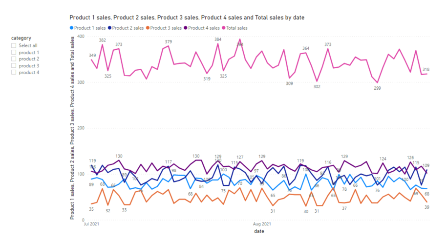
Everything looks peachy now at a glance, right? But no, unfortunately this does not work as soon as you use the slicer. You will realize all the product categories will still show up in the chart regardless of what you choose in the slicer — the only difference is, the “Total sales” will change based on the slicer. Here’s an example screenshot when I choose product 2 and product 3 in the slicer:

So let’s fix this next.
3. Fix the measures so only selected legend item(s) from the slicer will appear
SELECTEDVALUE() vs. CONTAINS()
SELECTEDVALUE() is well used when changing the measure application based on, literally, the selected value of a slicer. But in this case, SELECTEDVALUE() does not do the job because we want the multiple selection option for the slicer. When you choose only one value, SELECTEDVALUE() will work well, but if you choose multiple values from the slicer, then only the “first” selected slicer value will be registered and the rest will not show up. In this case, CONTAINS() comes to rescue.
modified measure
Let’s modify our Product 1~4 sales like this.
Product 1 sales = var calc = CALCULATE([sales], data[category] =”product 1″) return IF(CONTAINS(data, [category], “product 1”), calc, BLANK())
What it says is, if the data table’s category contains “product 1”, then return the variable calc but if not, return BLANK(). Let’s do this for Product 2~4 as well.
Once that’s done, try choosing a couple of categories again using the slicer. You will see it works as we intended. Here’s a screenshot when I click product 2 and product 3 now:

As you can see, the unchosen categories will still show up in “legend” but they will not show up in the chart itself.


Comments