Visualizing Monthly Seasonality in Power BI
- Soo Reed

- Feb 8, 2021
- 6 min read
Updated: Oct 3, 2022
This blog is about how to visualize monthly and weekly seasonality using Power BI. With this method, you can examine the seasonality and detect outliers ongoing basis.
Problem
Your business is most likely affected by seasonality. If you are not aware of, I highly recommend you check; you are likely to see a pattern which you can use to optimize your business further. Let’s say your business is more prosperous on the weekdays (Monday – Friday), and in the beginning of the month. If you want to compare several months at the same time to see how your business has been doing daily, aligning date to date does not work; for instance, July 1, 2020 is Wednesday, while August 1, 2020 is Saturday; which means your KPI on August 1, 2020 is likely lower than July 1, 2020 because of the weekday influence. For more precise comparison, you should compare the first full week’s Monday to another month’s first full week’s Monday, and so on.
Solution
Let’s create calculated columns that manipulate date format to create charts with week-day as x-axis and month as legend. It sounds mouthful, but the result would look something like this:
It may look a little daunting but creating this chart will not only provide an easy way for day to day comparisons, but also present how the data changes over time within a month. You will see it when it’s done!
TLDR
Decide whether you want the “full week” to start on Sunday or Monday.
Create a calculated column to get “month” using MONTH function.
Create a calculated column that yields two possible week-day format outcomes depending on whether a month starts with Sunday (or Monday, if your full week starts on Monday) or not. You will need: WEEKNUM, STARTOFMONTH, WEEKDAY, and IF functions.
Step by Step Guide with fake dataset
Here’s a fake dataset of experiments data we will use.
Screenshot showing only a part of the dataset:

This dataset includes random RPC (but with a distinctive weekday vs. weekend pattern) from March 1, 2020 to July 15, 2020.
First Step - decide whether a week starts on Sunday or Monday
Depending on your answer, code will slightly differ as it determines which week is incomplete. If you are not entirely sure, ask the stakeholders. For my analysis, I will make my week to start on Sunday. Therefore, any month that does not start on “Sunday” will have its first week as incomplete.
Second Step - create a Month column using MONTH function
The easiest part of this article! Where your date is residing, create a calculated column for Month using MONTH() function. It’s as easy as:
Month = MONTH(RPC[date])
***Note: it is highly recommended to create and use a ‘Calendar’ table. I will write more about the calendar table in the future, but for now, for simplicity sake, I am not going to create a calendar item. Besides, we are only using one table with one dimension (date) and one metric (RPC) so a calendar table to connect is not necessary. But if you do use a calendar table, follow the directions on the calendar table.
Last step - create week-day column with two possible outcomes
Although I aggregated this step into one, this is a little bit complicated with 4 sub steps. So let’s follow the logical step so you can understand.
Sub step 1:
to get week # and day #, first we need to calculate “week number” within the given month. If you thought of the WEEKNUM function, good job! You are on the right track. If you just use WEEKNUM(), however, you will get the week number of the given week within the year, not within the given month.
To get the week number within the given month, you need to get the week number of the particular week within the year and subtract week number of the first week of the month and then add 1. You may ask why adding 1 is needed; it’s because we are subtracting the first week of the month rather than last week of the previous month. I made this choice so we can write the code more easily. But that will come after I give you an example: June 7~13, 2020 yields 24 when WEEKNUM() is used. Since the first week of June’s WEEKNUM yields 23, you do: 24-23+1 = 2. Therefore, June 7-13, 2020 is the second week of June.
Now, let’s backtrack a little and write this out as code and see why we are subtracting the first week of the month, not last week of the previous month. It’s so that we could use STARTOFMONTH function, which conveniently exists. So, we can do:
WEEKNUM(date) – WEEKNUM(STARTOFMONTH(date)) + 1
If you put June 7, 2020 in that “date” field, it will give “2” as we expect.
Sub step 2:
we need week # and day #; now we have week #, so let’s focus on day #. How do we get the day of the week? We can use the WEEKDAY function. The only thing you need to be cautious for is the parameter. If your week starts on Sunday like my analysis, the 2nd parameter can be blank or 1. If your week starts on Monday, the second parameter should be 2. I wrote:
Day = WEEKDAY(PRC[date],1)
Now, you will notice that it produces numbers from 1 to 7, not strings such as Sunday or Monday. Although showing the string would make it more user-friendly, we need to have day by number so you can sort the chart’s x-axis by it. If needed, you can add after the day number but it can make the x-axis busy.
Sub step 3:
now you have both week # and day #, so let’s concatenate and put them together using &. So far, we got week number (1-6) and day number (1-7) and to make it more readable, I want to indicate which one is week number and which one is day number. To do so, I will use “w” and “d” in front. My code looks like this:
Week-day = “w” & WEEKNUM(date) – WEEKNUM(STARTOFMONTH(date)) + 1 & “ d” & WEEKDAY(PRC[date],1)
You can see that after “w” and before “d” is the code we created earlier in Sub step1 and after “d” is the code created in Sub step 2.
Now let’s see how the chart looks with this “Week-day” as x-axis and RPC as value. Make sure you sort the chart by “Sort ascending” and by “week-day” by clicking more options on the right upper corner of the chart (screenshot below):

Yay! Everything looks like we wanted it to be except…for March (yellow line). March 2020 happens to start on Sunday which makes its first week to be a full week unlike other months in the charts. Other months start with incomplete weeks so for them, week 1 is the incomplete one, and users only need to look at week 2 3, and 4 to compare. Since March’s first week is a full week, we want the first week of March to line up with other months’ full weeks, so week 2. To make that happen, we will have to add one more step.
Last sub step:
let’s use a simple IF statement. To simplify, let’s use a IF statement so if a month does not start with a full week, then we will subtract 1 from how we calculated the week number earlier.
***Alternatively, you can add 1 to the week number of the month starting with a full week (like March, 2020), but doing otherwise will make the incomplete first week into week 0 and the complete first week to week 1, making it easier and more understandable to the stakeholders.
Correspondingly, if a month starts with a full week (in my case, starts with Sunday), we will leave the week number alone. To make this more understandable, I will use “var” and “return” statements (if you don’t know about “var” and “return” go and read this blog):
var startWithSunday = “w” & 1 + ‘calendar'[weeknumber] – weeknum(STARTOFMONTH(‘calendar'[date])) & ” d” & ‘calendar'[weekday] var others = “w” & ‘calendar'[weeknumber] – weeknum(STARTOFMONTH(‘calendar'[date])) & ” d” & ‘calendar'[weekday] return if(WEEKDAY(STARTOFMONTH(‘calendar'[date],1) = 1, startWithSunday, others)
Using this new calculated column as x-axis, you will see the chart change to this:

Now the yellow line for March starts at w1d1 while other months start in the middle of w0 as we intended. Now the stakeholders can easily compare the three full weeks of data for all the given months. And also by putting all the incomplete first week as week 0, you can reduce use filter panel to get rid of w0 and w 4,5 (also incomplete weeks for April and June) and present only full 3 weeks of data like below:
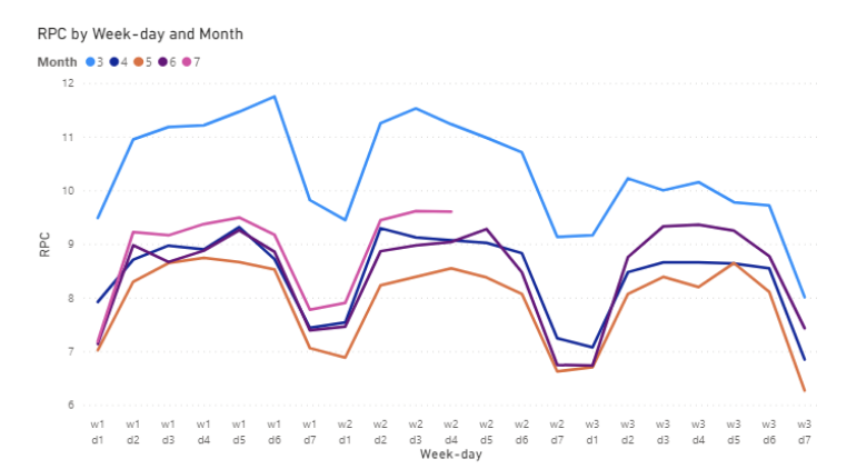
Now you can easily see how March through June performance have been like for the full three weeks and see how July (pink line) is doing compared to other months. As promised, this chart not only provides an easy way for day to day comparison over month and week, but also shows you how the data changes within a month; for instance, looking at March data, you can see that RPC has decreased significantly within March week over week.
Try using this chart a couple of times for your analysis. See what it can tell you about your organization that other charts cannot easily show!


Comments