dynamic growth rate with control variant option
- Soo Reed

- Jan 4, 2021
- 7 min read
Updated: Oct 3, 2022
How to create dynamic growth/decline rate calculations with a control variant option
Do you have to calculate % growth (growth rate) and you want to give an option to choose the standard/control/denominator variable? You can do so in Power BI using DAX.
***Important: This how-to is based on, and a step up version of, How to create an interactive metric selection for one visualization. If you have not read the blog, I highly encourage you to read the blog first. You can follow this post without reading the other one first, but doing so will make this how-to guide easier to understand.
Problem
A unique challenge I faced creating an automated report for the CRO team was the fluid control group (side note, if you are not sure what CRO team does, check out basics of digital marketing here). CRO Team used lift calculation – essentially growth rate of an experiment variant compared to the control group: (variant – control) / control. This is easy to calculate in Power BI but the challenge was that the control group was not always experiment variant 0.
Background
Our CRO Team uses Google Optimize to conduct A/B Testing and as of date, Optimize does not offer any filter or modification option on experiment variant 0 (control group). So if the CRO team wants to put a tag on the control group for a specific tracking purpose, they have to create variant 1 as a control group; which means the growth rate calculation should be against variant 1, not variant 0: (variant 2 – variant 1) /variant 1. While other times, variant 0 would be the control group so the calculation should be against variant 0 like this: (variant 2 – variant 0)/variant 0
Vision
I want to create a slicer for the control group (option: 0 and 1) and have a table with all the metrics and each metric’s growth rate that changes dynamically based on control group selection on the slicer.
Solution
So let’s create the functionality for users to choose a control group between variant 0 and variant 1 for growth rate calculation.
TLDR
Create a table with the possible control variant value
Create measures for the following:
Control Metric: using SWITCH function
Growth Rate Metric: using CALCULATE and SELECTEDVALUE functions
Step by Step Guide with fake dataset
Here’s a fake dataset for experiments I will use.
Screenshot showing only a part of the dataset:
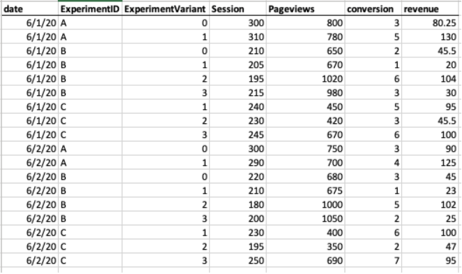
ou cannot tell from the dataset, but the control group for each Experiment ID is — with real data, you will have to get this information from the CRO team:
A – 0 B – 1 C – 1
Now what I want to do is to create growth rate columns for metrics, Page per Session, Conversion, and Revenue. So I will import this dataset to a Power BI file.
***IMPORTANT: when you import, go to Transform data and make sure Experiment Variant’s data format is “Text” not numeric. We will use string functions in the process.
1st step - create any basic calculated metrics that are needed
For this dataset, I will need pageviews per session, conversion rate, and RPC (revenue per conversion). So I will create following measures:
Pageviews per session = SUM(Experiments[Pageviews])/SUM(Experiments[Sessions]) Conversions rate = SUM(Experiments[Conversion])/SUM(Experiments[Sessions]) RPC = SUM(Experiments[revenue])/SUM(Experiments[conversion])
For my own sanity, I love creating a key measure table to keep all the measures in one place. If you are not familiar with a key measure table, check out my blog [ ] which will save you time and energy when working on Power BI dashboards.
2nd step - create a table with the possible control variant value
In power bi, click [Home] tab > [Enter data] and write a list of possible control variants as values. For my fake dataset, it will be 0 and 1.
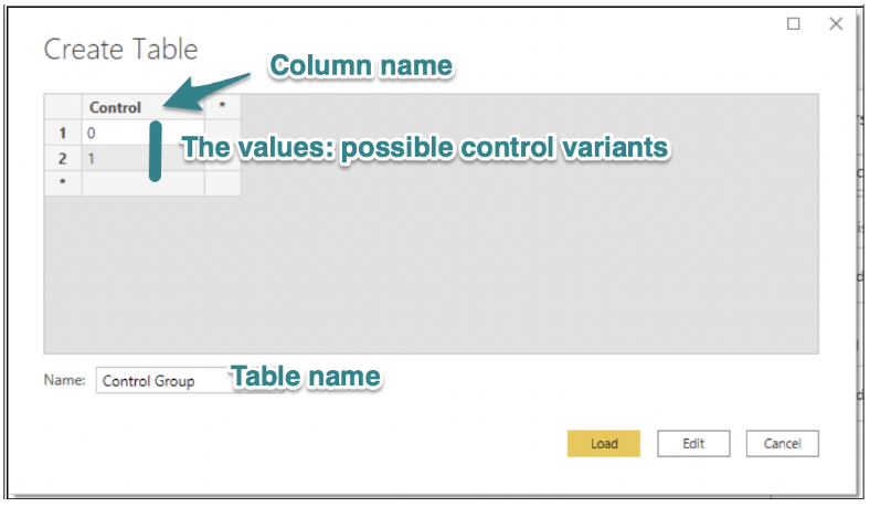
Now, just like the experiment variant column in the earlier step, we need to set the data format to “Text” for this table as well so that we can use text/string function. So go to [Transform Data] > select the table you created: [Control Group] > change the data format to Text.
3rd step - create control measure using SWITCH function
Per metric you want to calculate growth rate of, you have to create a Control Measure. You can do so by using the SWITCH function. Let’s start with Conversion:
Control Conversion = SWITCH(VALUES(‘Control Group'[Control]), “0”, CALCULATE(SUM(Experiments[conversion]), FILTER(Experiments, Experiments[experimentVariant] = “0”)), “1”, CALCULATE(SUM(Experiments[conversion]), FILTER(Experiments, Experiments[ExperimentVariant] = “1”)) )
Now let’s look into this measure line by line:
SWITCH(VALUES(‘Control Group’[Control]), — based on the control group table value, use switch function “0”, CALCULATE(SUM(Experiments[conversion]), FILTER(Experiments, Experiments[experimentVariant] = “0”)), –if control column is “0”, then give me total conversion after filtering experiments table to pull only experiment variant “0” “1”, CALCULATE(SUM(Experiments[conversion]), FILTER(Experiments, Experiments[experimentVariant] = “1”)) ) –if control column is “1”, then give me total conversion after filtering experiments table to pull only experiment variant “1”
Once you write it, you can just copy and paste for the other metrics. For pre-calculated metrics, such as conversion rate, you only need to change SUM(Experiments[conversion]) to [Conversion rate]. Here’s an example:
Control Conversion Rate = SWITCH(VALUES(‘Control Group'[Control]), “0”, CALCULATE([Conversion rate], FILTER(Experiments, Experiments[experimentVariant] = “0”)), “1”, CALCULATE([Conversion rate], FILTER(Experiments, Experiments[ExperimentVariant] = “1”)) )
So for each metric, create a control measure. I created control measures for the following: Pageview per Session, Conversion, Revenue, Conversion Rate, RPC
4th step - create growth rate metric using CALCULATE and SELECTEDVALUE functions
Per metric you want to calculate growth rate of, you have to create a growth rate measure. You can do so by using CALCULATE and SELECTEDVALUE functions. Let’s start with Conversion:
Conversion Growth Rate = var controlV = CALCULATE([Control Conversion], ALL(Experiments[experimentVariant])) var lift = (SUM(Experiments[conversion])-controlV)/controlV return IF(SELECTEDVALUE(‘Control Group'[Control]) = SELECTEDVALUE(Experiments[experimentVariant]), BLANK(), iferror(lift, BLANK()))
Like earlier, let’s go through line by line:
Conversion Growth Rate = var controlV = CALCULATE([Control Conversion], ALL(Experiments[experimentVariant])) — here I am defining variable “controlV” which is a control group. ALL(Experiments[experimentVariant]) is needed since I want the control group value to show up even when the selected value is not a control group. ALL() removes the filter. CALCULATE is used to apply ALL(). var lift = (SUM(Experiments[conversion])-controlV)/controlV — This calculates growth rate. SUM(Experiments[conversion]) calculates the selected experiment variant’s conversion. return IF(SELECTEDVALUE(‘Control Group'[Control]) = SELECTEDVALUE(Experiments[experimentVariant]), BLANK(), IFERROR(lift, BLANK())) — I didn’t want growth rate 0% to show for control group. I also did not want DIV/0 Error to show when a variant has value for a metric but a control group does not (hence divided by 0 error). So here I am using IF and IFERROR statements to show blank in both cases.
For the already calculated metrics, here’s an example (conversion rate growth rate):
Conversion Rate Growth Rate = var controlV = CALCULATE([Control Conversion Rate], ALL(Experiments[experimentVariant])) var lift = ([Conversion rate]-controlV)/controlV return IF(SELECTEDVALUE(‘Control Group'[Control]) = SELECTEDVALUE(Experiments[experimentVariant]), BLANK(), iferror(lift, BLANK()))
Now you copy and paste this measure to create growth rate measures for the rest of the metrics: pageviews per session, conversion rate, revenue, and RPC. Make sure all the growth rates are in percentage format.
5th and the last step - create a slicer for the control group and create a table with the metric and growth rate measures
Create a slicer for the control group so the users can choose either variant 0 or variant 1. Make the selection type for the slicer “single-select only” so the measures will work appropriately. If you do not make it single-select only, when you choose more than one control variant, the measures will throw an error.
Then, create a table with:
Rows: Experiment ID, Experiment Variants
Values: sessions, pageviews per sessions, pageviews per session growth rate, conversion, conversion growth rate, conversion rate, conversion rate growth rate, revenue, revenue growth rate, RPC, and RPC growth rate.
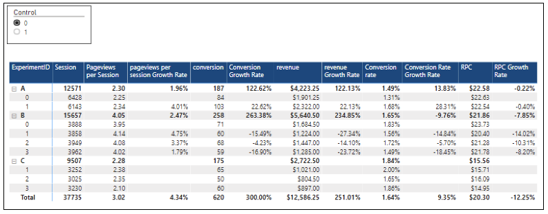
Here’s the screenshots of the outcome. I changed the column headers format for easier consumption:
Default: control variant: 0
As you can see in the image, all the growth rate columns for variant 0 are empty while for variant non-zero, it is calculating (variant non-zero – variant 0)/variant 0.
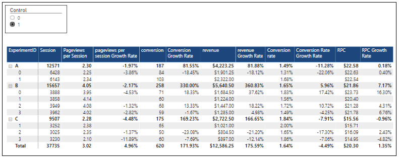
When you select control variant: 1
As you can see in the image, all the growth rate columns for variant 1 are empty while for variant that’s not 1, it is calculating (variant that’s not 1 – variant 1)/variant 1.
Bonus - one interactive chart with two slicers
You can also use these growth rate measures to create charts. A line chart will be a great choice to observe the growth rate changes over time. So I created this chart that changes its value based on two slicers: 1. Control variant selection, and 2. Metric selection. What it does is, the metric (such as session, conversion, RPC) the chart displays changes based on the selection and the value will change based on the control group.

Doing so saves much space and makes the dashboard more interactive to users. If you don’t know how to do this, check out this blog [Power BI: 4 simple steps to create one chart with multiple Metric choices]; it’s an easier version of what we just went through so it should be a breeze for you! One thing to remember though, the particular blog goes through the regular metric selection; for this particular growth metric, you will want to create a growth metric selection measure like this:
Growth Metric Selection =
SWITCH(VALUES(‘Metric Select’[Metrics]), “Sessions”, [Sessions Growth Rate], “Pageviews Per session”, [pageviews per session Growth Rate], “Conversions”, [Conversion Growth Rate], “Conversion Rate”, [Conversion Rate Growth Rate], “Revenue”,[revenue Growth Rate], “RPC”, [RPC Growth Rate])
And put this “Growth Metric Selection” as the [Values] in a line chart!
Conclusion
Power BI offers an incredible amount of flexibility when it comes to calculations. In this post, the final chart was highly interactive, using two different slicers to choose the metric to display and the control variant for growth rate calculation. If you had to create a measure for each control variant and for each metric, the amount of measures you have to create would have been doubled. This is not the kind of work you read and get immediately, so I really encourage you to follow these steps and try it out. Once you have this down, you will be able to create other calculations that are interactive and time-saving.


Comments